Widgets List
SmartUI
Include SmartUI Widget
A widget that can be used to include a Smart View tile in a form view.
Widget works only in enabled view templates
This widget can be utilized only if the view's view templates supports it.
Currently the enabled view templates are: for library version V3 SmartView, SmartView Task, SmartView Embeddable, for library version V2: CS16 Smart UI 16.0.3 Widgets
To enable the usage of this widget in any other V3 view template you should add the line below in the head section of the view template's HTML code.
<script src="${url}/widgets?crossOrigin=false"></script>
Configuration
| Property | Type | Default | Usage |
|---|---|---|---|
| Basics | |||
| Widget ID | input | myWidget | A javascript identifier for the region in which the widget will be rendered, should be unique within the html page |
| Script ID | input | The unique identifier of the Content Script or Node that serves as source for the Smart View tile | |
| Widget Type | select | The Smart View tile you want to use. The possibile values are: Nodetables (standard Smart View Node Table tile is the only optione that requires a container to be used as source (Script ID) in place of a Content Script), Html (AnswerModules Content Script Result tile), Chart (AnswerModules Content Script Tile Chart tile), Links (AnswerModules Content Script Tile Links tile), Tree (AnswerModules Content Script Tile Tree tile), Dynamic nodetables (AnswerModules Content Script Node Table tile) |
|
| Options | textareasplit | Additional parameters to be used when invoking the Content Script datasource | |
| Wrap It | checkbox | false | Wrap the script result into a 'div' element which uses in the row the amount of space specified by the 'columns' property |
| Page size | input | false | Nodetables and Dynamic nodetable only: number of nodes to be displayed on each page. |
| Is scrollable? | checkbox | true | If true the Tile's body will be scrollable. |
| Is context aware? | checkbox | false | If true the Content Script datasource will be invoked, and the tile updated, everytime a browsing action is performed. The datasource will be invoked passing to it the current space's unique identifier in the uiParentID parameter. |
| Display header? | checkbox | true | If true the Tile's header will be displayed. |
| Chart Library | select | Chart.js | Chart only: the Javascript library to be used for creating the chart. |
| Chart Library | select | Bubble (Chart.js only) | Chart only: the chart type. |
| Chart Size | select | Two-thirds | Chart only: the amount of space used by the chart. |
| Client id | input | myWidgetClientId | Chart only: a javascript identifier for the region in which the chart will be rendered, should be unique within the html page. |
| Appearance | |||
| columns | select | 6 | Number of grid columns used by the widget |
| Fixed size | checkbox | false | Preserves widget proportional dimension |
| Title | input | My widget | The Tile's title |
| Tilebar icon | input | The css class to be used for displaying the icon in the Tile's header | |
| showIf | comlpex | true | Widget's visibility rules |
| Module Suite Icons color schema | select | The Color code to be used for the Tile's header icon | |
| Module Suite Icon | input | The Tile header icon | |
| Additional css classes | input | Custom CSS classes to be added to the widget's container |
Bootstrap
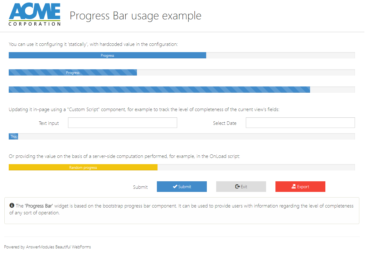
Progress Bar
A widget based on the bootstrap progress bar component. It can be used to provide users with information regarding the level of completeness of any sort of operation
Configuration
| Property | Type | Default | Usage |
|---|---|---|---|
| Basics | |||
| Text | input | Progress | The text to be displayed in the progress bar |
| Value | input | 57 | The value to be displayed in the progress bar |
| Striped | checkbox | false | Applies stripes to the progress bar |
| Active | checkbox | false | Animates the progress bar |
| Appearance | |||
| columns | select | 6 | Number of grid columns used by the widget |
| Fixed size | checkbox | false | Preserves widget proportional dimension |
| showIf | comlpex | true | Widget's visibility rules |
| Additional css classes | input | Custom CSS classes to be added to the widget's container |
Example
Buttons
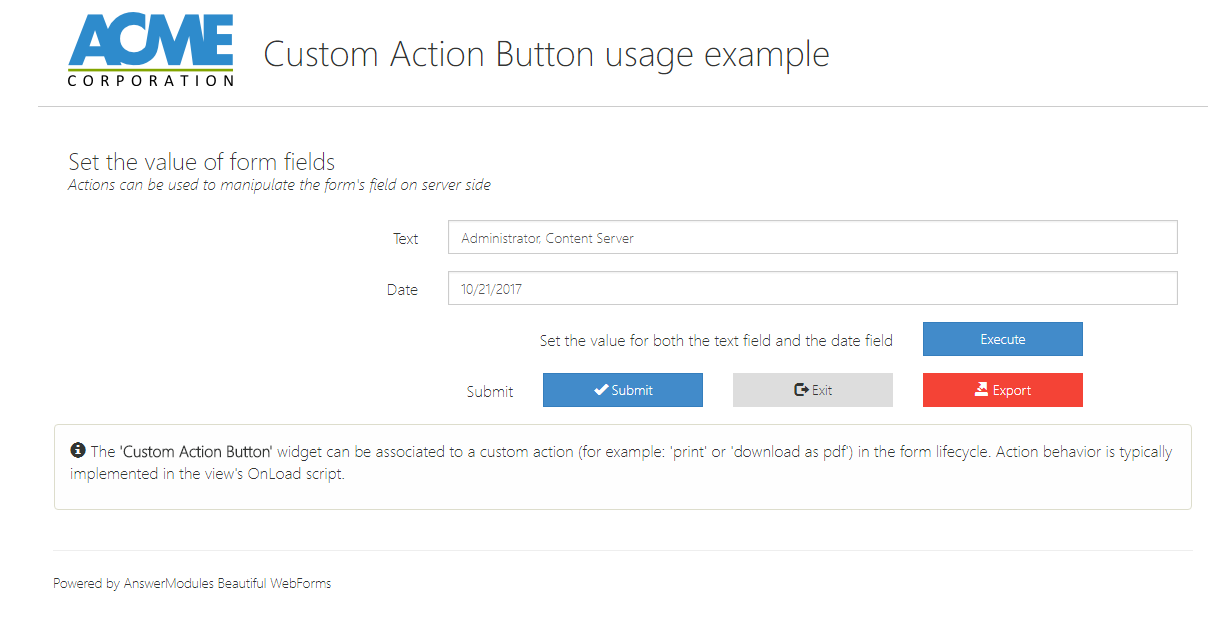
Custom Action Button
A button that can be associated to a custom action (for example: 'print' or 'download as pdf') in the form lifecycle. Action behavior is typically implemented in the view's OnLoad script.
Custom Action Button
This widget requires some Content Script code to be injected in the CLEH scripts
Configuration
| Property | Type | Default | Usage |
|---|---|---|---|
| Basics | |||
| Action | input | am_customAction | The action to be triggered |
| Action Parameters | input | The action's parameter | |
| Action's body (F11 to full screen) | textarea | The action's script body. Action's parameter is available as 'actionsParameters' | |
| No Ajax | checkbox | false | Trigger the action disabling ajax reload |
| Validate | checkbox | false | Validates the form before to trigger the action |
| Appearance | |||
| columns | select | 6 | Number of grid columns used by the widget |
| Fixed size | checkbox | false | Preserves widget proportional dimension |
| Label Text | input | Custom Action Button | The text label of this input field |
| Label Size | select | The size of the input label | |
| Label Position | select | The widget's label position one out: right, top, left, bottom | |
| Bold Label | checkbox | false | Display the widget's label in bold |
| showIf | comlpex | true | Widget's visibility rules |
| Button Label | input | Button | The text label of this input field |
| Button Type | select | The button's color schema | |
| Button Icon | input | The button's icon | |
| Dimension | select | The button's dimension | |
| color | select | A custom color to be used either to identify the widget or to skin it | |
| Additional css classes | input | Custom CSS classes to be added to the widget's container |
Example
In the example the button is used to set at once two form fields with predefined values.
Example Configuration
| Property | Value | ||
|---|---|---|---|
| Action's body (F11 to full screen) |
|
Display Attachments
A button that will open a popup window showing the attachments of the current workflow. Designed to be used with a workflow step form.
Configuration
| Property | Type | Default | Usage |
|---|---|---|---|
| Basics | |||
| Alternative message | input | Oops, attachments folder is undefined | To be displayed if there is no attachments folder |
| Appearance | |||
| columns | select | 6 | Number of grid columns used by the widget |
| Fixed size | checkbox | false | Preserves widget proportional dimension |
| Label Text | input | Open attachments | The text label of this input field |
| Label Size | select | The size of the input label | |
| Label Position | select | The widget's label position one out: right, top, left, bottom | |
| Bold Label | checkbox | false | Display the widget's label in bold |
| showIf | comlpex | true | Widget's visibility rules |
| Button Label | input | Button | The text label of this input field |
| Button Type | select | The button's color schema | |
| Button Icon | input | The button's icon | |
| Dimension | select | The button's dimension | |
| Additional css classes | input | Custom CSS classes to be added to the widget's container |
Modal Action Button
A button that will open an overlay panel. Should be used in combination with a "Modal Container" object, which it controls, and which may contain additional buttons or other components. A typical possible usage is to implement actions that require user confirmation.
Configuration
| Property | Type | Default | Usage |
|---|---|---|---|
| Basics | |||
| Modal ID | input | CSS identifier for the modal pane (e.g. #myPanel) | |
| Appearance | |||
| columns | select | 6 | Number of grid columns used by the widget |
| Fixed size | checkbox | false | Preserves widget proportional dimension |
| Label Text | input | Modal Button | The text label of this input field |
| Label Size | select | The size of the input label | |
| Label Position | select | The widget's label position one out: right, top, left, bottom | |
| Bold Label | checkbox | false | Display the widget's label in bold |
| showIf | comlpex | true | Widget's visibility rules |
| Button Label | input | Button | The text label of this input field |
| Button Type | select | The button's color schema | |
| Button Icon | input | The button's icon | |
| Dimension | select | The button's dimension | |
| Additional css classes | input | Custom CSS classes to be added to the widget's container |
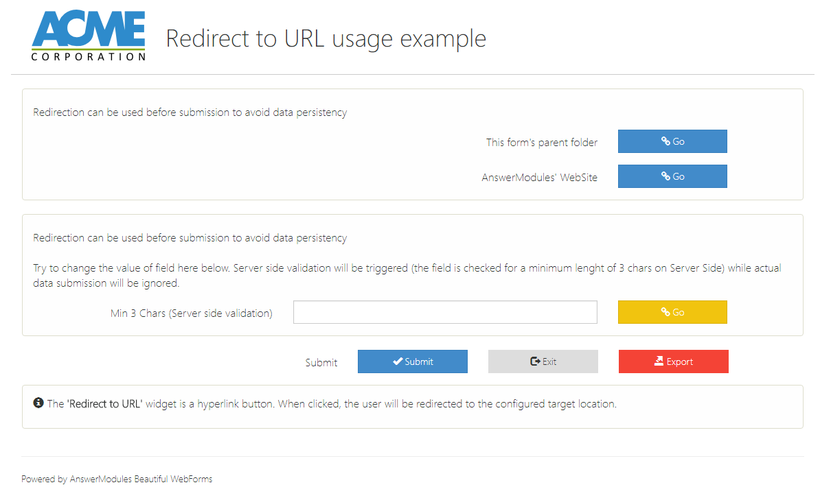
Redirect to URL
A hyperlink button. When clicked, the user will be redirected to the configured target location.
Redirect to URL
This widget requires some Content Script code to be injected in the CLEH scripts
Configuration
| Property | Type | Default | Usage |
|---|---|---|---|
| Basics | |||
| Action | input | am_redirect_noAjax | The action to be triggered |
| URL where to redirect user's browser | input | $ | The Url where to redirect the navigation |
| When to redirect | select | When to trigger the redirection | |
| Appearance | |||
| columns | select | 6 | Number of grid columns used by the widget |
| Fixed size | checkbox | false | Preserves widget proportional dimension |
| Label Text | input | Redirect | The text label of this input field |
| Label Size | select | The size of the input label | |
| Label Position | select | The widget's label position one out: right, top, left, bottom | |
| Bold Label | checkbox | false | Display the widget's label in bold |
| showIf | comlpex | true | Widget's visibility rules |
| Button Label | input | Button | The text label of this input field |
| Button Type | select | The button's color schema | |
| Button Icon | input | The button's icon | |
| Dimension | select | The button's dimension | |
| Additional css classes | input | Custom CSS classes to be added to the widget's container |
Example
In the example two Redirect to URL button are used. The first one trigger an immediate redirection towards the form's parent folder content. The second one is used to trigger a redirection towards an external website upon submission. There is no need for displaying the latter in the form. It can be hidden using it's showIf property (e.g. using a custom expression equal to: false).
Example Configuration
| Property | Value |
|---|---|
| Action | am_redirect_noAjax2 |
| URL where to redirect user's browser | http://www.answermodules.com |
| When to redirect | After valid submission |
| columns | 12 |
| Label Text | This button triggers a redirection after submission (can be hidden using the showIf property) |
| Label Size | 8 |
| Property | Value |
|---|---|
| Action | am_redirect_noAjax |
| URL where to redirect user's browser | $docman.getNode($form.amId).parent.menu.open.url |
| When to redirect | Immediately |
| columns | 12 |
| Label Text | This button triggers a redirection to the form's parent folder |
| Label Size | 8 |
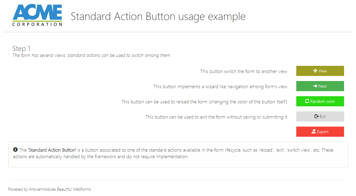
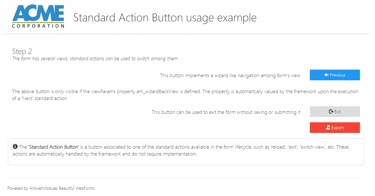
Standard Action Button
A button associated to one of the standard actions available in the form lifecycle, such as 'reload', 'exit', 'switch view', etc. These actions are automatically handled by the framework and do not require implementation.
Configuration
| Property | Type | Default | Usage |
|---|---|---|---|
| Basics | |||
| Action | select | The action to be triggered | |
| Action Parameters | input | The action's parameter | |
| Appearance | |||
| columns | select | 6 | Number of grid columns used by the widget |
| Fixed size | checkbox | false | Preserves widget proportional dimension |
| Label Text | input | Trigger action | The text label of this input field |
| Label Size | select | The size of the input label | |
| Label Position | select | The widget's label position one out: right, top, left, bottom | |
| Bold Label | checkbox | false | Display the widget's label in bold |
| showIf | comlpex | true | Widget's visibility rules |
| Button Label | input | Button | The text label of this input field |
| Button Type | select | The button's color schema | |
| Button Icon | input | The button's icon | |
| color | select | A custom color to be used either to identify the widget or to skin it | |
| Dimension | select | The button's dimension | |
| Additional css classes | input | Custom CSS classes to be added to the widget's container |
Example
A few usage example of the widget.
Example Configuration
| Property | Value |
|---|---|
| Action | Switch View |
| Action Parameters | $form.viewParams.views['View2'] |
| Appearance | |
| columns | 6 |
| Fixed size | false |
| Label Text | Trigger action |
| Label Size | |
| Label Position | |
| Bold Label | false |
| showIf | |
| Button Label | Button |
| Button Type | |
| Button Icon | |
| color | red-400 |
| Dimension | |
| Additional css classes | |
Submit Button
A button that will submit the current form. Clicking the button will trigger form validation: submission will be interrupted if the form content causes validation errors.

Configuration
| Property | Type | Default | Usage |
|---|---|---|---|
| Appearance | |||
| columns | select | 6 | Number of grid columns used by the widget |
| Fixed size | checkbox | false | Preserves widget proportional dimension |
| Label Text | input | Submit | The text label of this input field |
| Label Size | select | The size of the input label | |
| Label Position | select | The widget's label position one out: right, top, left, bottom | |
| Bold Label | checkbox | false | Display the widget's label in bold |
| showIf | comlpex | true | Widget's visibility rules |
| Button Label | input | Submit | The text label of this input field |
| Button Type | select | The button's color schema | |
| Button Icon | input | The button's icon | |
| Dimension | select | The button's dimension | |
| Additional css classes | input | Custom CSS classes to be added to the widget's container |
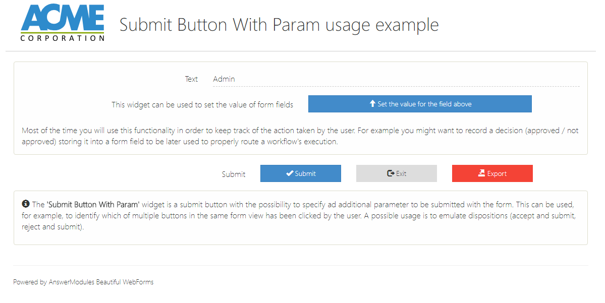
Submit Button With Param
A Submit Button with the possibility to specify ad additional parameter to be submitted with the form. This can be used, for example, to identify which of multiple buttons in the same form view has been clicked by the user. A possible usage is to emulate dispositions (accept and submit, refuse and submit).
Submit Button With Param
This widget requires some Content Script code to be injected in the CLEH scripts
Configuration
| Property | Type | Default | Usage |
|---|---|---|---|
| Basics | |||
| Action Parameters | input | YES | The parameter that will allow you to distinguish which submit button has been clicked |
| When to assign values | select | When to execute the action (and if needed change the value for the selected form's fields) | |
| Form fields | textareasplit | Assign the specified value to each field before to submit | |
| Action | This button can be also used to trigger a server-side action which can be used to assign values to the form's fields. WARNING: adding an action will automatically prevent submission | ||
| Action | input | Adding an action will automatically prevent submission | |
| No Ajax | checkbox | false | Trigger the action disabling ajax reload |
| Validate | checkbox | false | Validates the form before to trigger the action |
| Javascript callback to call before action | input | A javascript function to be called before to execute the action. Should return true if the action can be performed. | |
| Appearance | |||
| columns | select | 6 | Number of grid columns used by the widget |
| Fixed size | checkbox | false | Preserves widget proportional dimension |
| Label Text | input | Submit Button With Param | The text label of this input field |
| Label Size | select | The size of the input label | |
| Label Position | select | The widget's label position one out: right, top, left, bottom | |
| Bold Label | checkbox | false | Display the widget's label in bold |
| showIf | comlpex | true | Widget's visibility rules |
| Button Label | input | Button | The text label of this input field |
| Button Type | select | The button's color schema | |
| Button Icon | input | The button's icon | |
| Dimension | select | The button's dimension | |
| Additional css classes | input | Custom CSS classes to be added to the widget's container |
Example
Submit Button with Param used to set the value of a form's field before and upon submission.
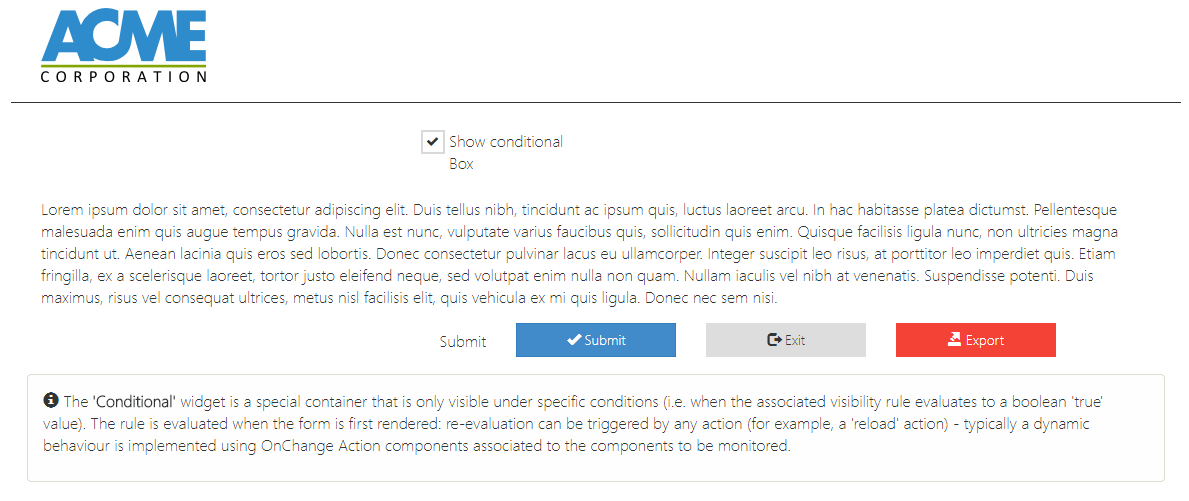
Conditional
Conditional
A special container that is only visible under specific conditions (i.e. when the associated visibility rule evaluates to a boolean 'true' value). The rule is evaluated when the form is first rendered: re-evaluation can be triggered by any action (for example, a 'reload' action) - typically a dynamic behaviour is implemented using OnChange Action components associated to the components to be monitored.
Configuration
| Property | Type | Default | Usage |
|---|---|---|---|
| Basics | |||
| Condition | condition | [:] | a valid templating expression that evaluates either to true or false. The expression is used to determine if the widget (and its content) will be rendered in the page. |
| Advance condition | input | a valid templating expression that evaluates either to true or false. The expression is used to determine if the widget (and its content) will be rendered in the page. | |
| color | select | A custom color to be used either to identify the widget or to skin it |
Example
Example Configuration
| Property | Value |
|---|---|
| Basics | |
| Condition | 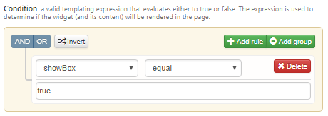 |
Conditional Else
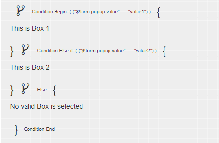
A special component used to alterate the behaviour of a "Conditional" component. Must be placed inside a "Conditional" component: in this case, it will split the "Conditional" area in two sections. The section before the "Conditional Else" will continue to be visible if the rule associated to the "Conditional" evaluates to true. The section after the else will be visible if the rule evaluates to "false". Typically used to present two alternative sets of components based on a single rule. Only one "Conditional Else" is allowed inside a single "Conditional" component.
Conditional ElseIf
A special component used to alterate the behaviour of a "Conditional" component. Must be placed inside a "Conditional" component, but before any "Conditional Else" component. It allows to split the area in two sections, and to specify an alternative boolean visibility rule on the second section. This rule will be evaluated if the one on the enclosing "Conditional" evaluates to false. It is allowed to have more than one "Elseif" component inside a single "Conditional" component: in this case, the rules will be evaluated sequentially, until one evaluates to "true".
Configuration
| Property | Type | Default | Usage |
|---|---|---|---|
| Basics | |||
| Condition | condition | [:] | a valid templating expression that evaluates either to true or false. The expression is used to determine if the widget (and its content) will be rendered in the page. |
| Advance condition | input | a valid templating expression that evaluates either to true or false. The expression is used to determine if the widget (and its content) will be rendered in the page. | |
| color | select | A custom color to be used either to identify the widget or to skin it |
Conditional Users
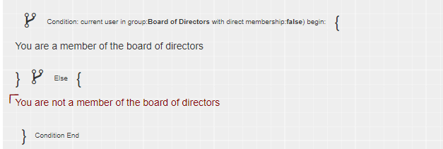
The 'Conditional Users' widget is a container object, variant of the "Conditional" component, in which the visibility rule considers the user accessing the form. Typically used to keep portions of a form visible only to a limited number of users.
Configuration
| Property | Type | Default | Usage |
|---|---|---|---|
| Basics | |||
| User or Group | input | Either a user or a group of users | |
| Direct membership | checkbox | false | True if you want to check for direct membership only |
| color | select | A custom color to be used either to identify the widget or to skin it |
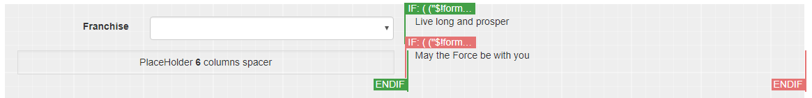
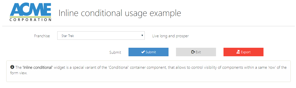
Inline conditional
A special variant of the 'Conditional' container component, that allows to control visibility of components within a same 'row' of the form view.
Configuration
| Property | Type | Default | Usage |
|---|---|---|---|
| Basics | |||
| Condition | condition | [:] | a valid templating expression that evaluates either to true or false. The expression is used to determine if the widget (and its content) will be rendered in the page. |
| Advance condition | input | a valid templating expression that evaluates either to true or false. The expression is used to determine if the widget (and its content) will be rendered in the page. | |
| color | select | A custom color to be used either to identify the widget or to skin it |
PlaceHolder
A special variant of the 'Empty' component to be used in combination with the 'Inline conditional' component. This component can be used to fine tune the row and columns positioning for alternative inline blocks.
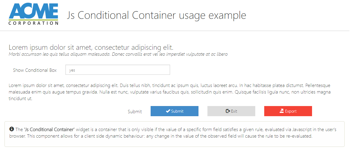
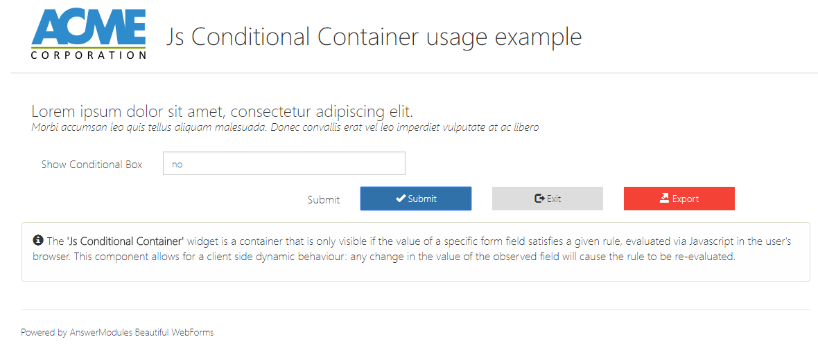
Js Conditional Container
A container that is only visible if the value of a specific form field satisfies a given rule, evaluated via Javascript in the user's browser. This component allows for a client side dynamic behaviour: any change in the value of the observed field will cause the rule to be re-evaluated.
Configuration
| Property | Type | Default | Usage |
|---|---|---|---|
| Basics | |||
| id | select | Form's field | |
| Condition | select | A check operation to be performed over the form's field value | |
| Field value | input | The value used in combination with the selected operation to verify the value of the form's field | |
| Container unique name | input | c0001 | A unique DOM id to be assigned to the box container |
| Is Hidden? | checkbox | true | Initial State of the component |
| color | select | A custom color to be used either to identify the widget or to skin it |
Containers
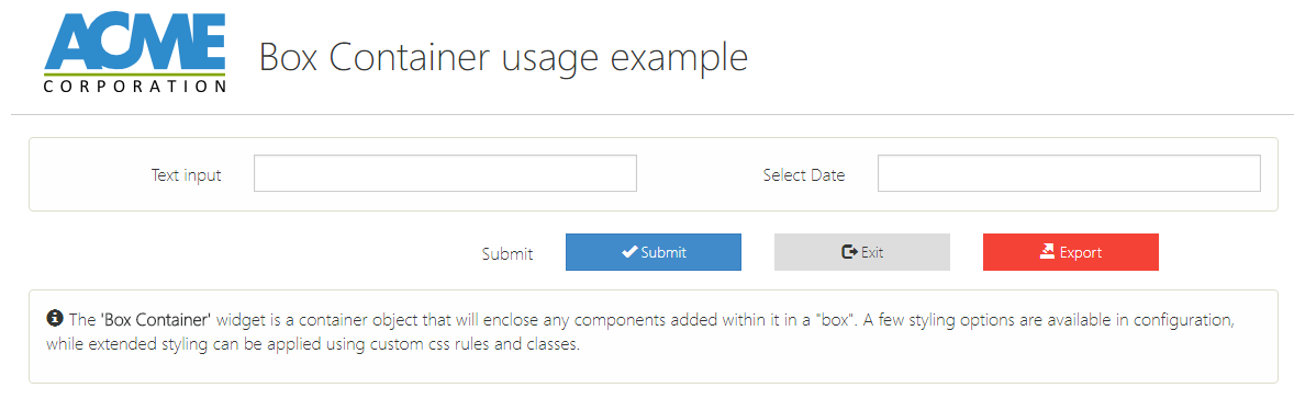
Box Container
A container object that will enclose any components added within it in a "box". A few styling options are available in configuration, while extended styling can be applied using custom css rules and classes.
Configuration
| Property | Type | Default | Usage |
|---|---|---|---|
| Appearance | |||
| Box type | select | The shape of the box | |
| Box color scheme | select | The box's color schema | |
| Additional css classes | input | Custom CSS classes to be added to the widget's container | |
| color | select | A custom color to be used either to identify the widget or to skin it | |
| showIf | comlpex | true | Widget's visibility rules |
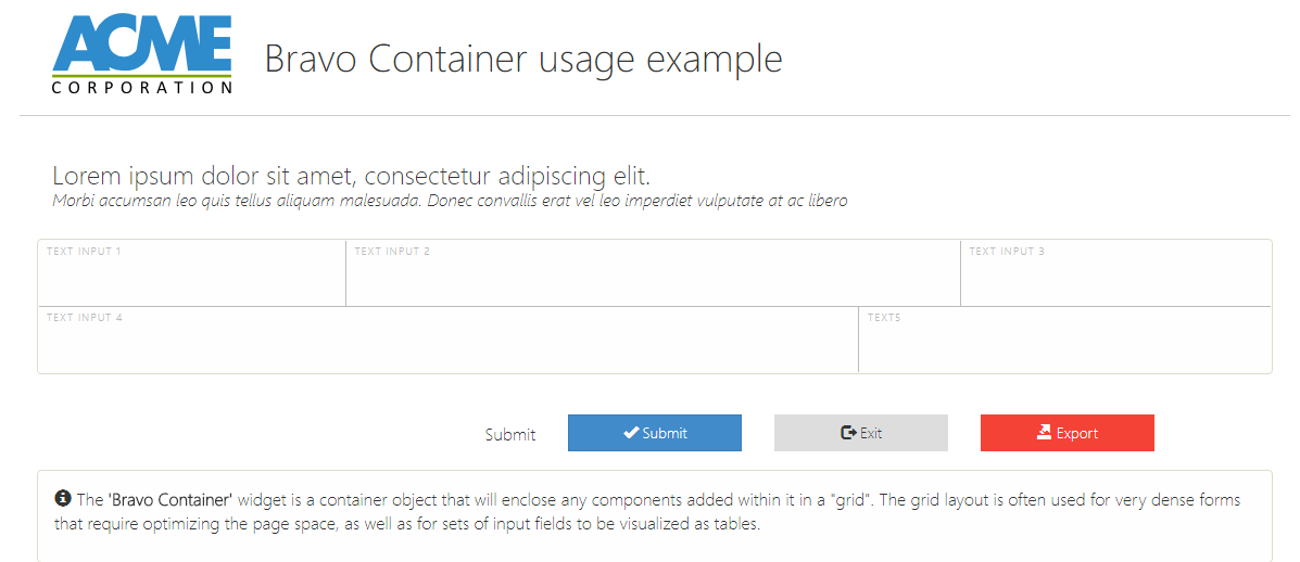
Bravo Container
A container object that will enclose any components added within it in a "grid". The grid layout is often used for very dense forms that require optimizing the page space, as well as for sets of input fields to be visualized as tables.
Configuration
| Property | Type | Default | Usage |
|---|---|---|---|
| Appearance | |||
| Box type | select | The shape of the box | |
| Box color scheme | select | The box's color schema | |
| Additional css classes | input | Custom CSS classes to be added to the widget's container | |
| color | select | A custom color to be used either to identify the widget or to skin it | |
| Include static resource ? | checkbox | false | This component requires static resources (am_gridTable.css) to be included in page. If deselected, make sure that the required resources are already imported elsewhere (for example, in the form's associated template) |
| showIf | comlpex | true | Widget's visibility rules |
Example
Example Configuration
| Property | Value |
|---|---|
| Appearance | |
| Custom Style | padding:1px |
Datatable
The 'Datatable' allows you to present the user a set of searchable and paginated data leveraging the well known Datatable (https://datatables.net/) javascript library. The widget allows the end user to perform a multi-items selection among the rendered data and use it to pass parameters to a custom CLEH action.
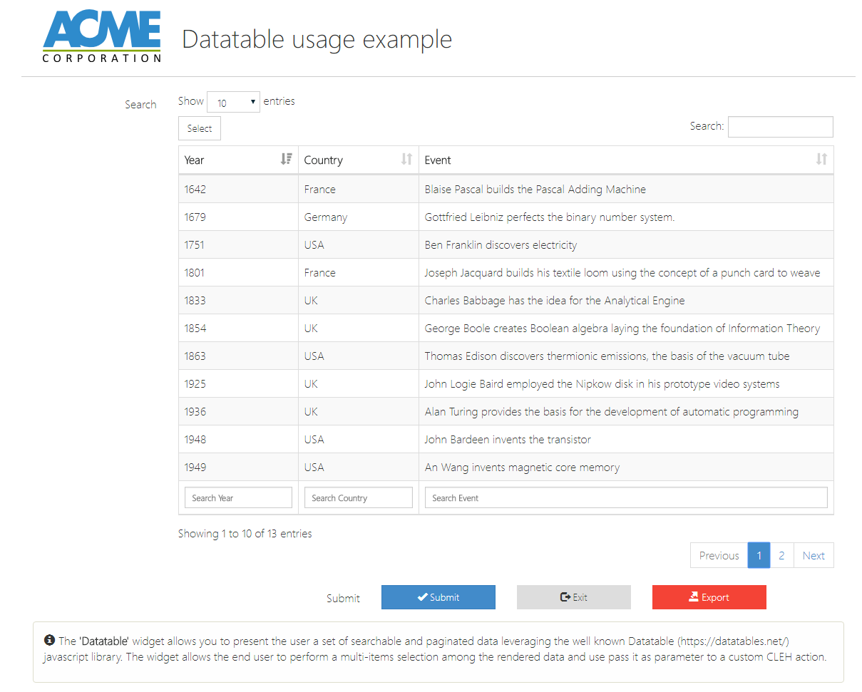
Datatable
This widget requires some Content Script code to be injected in the CLEH scripts
Configuration
| Property | Type | Default | Usage |
|---|---|---|---|
| Basics | |||
| id | select | Form's field | |
| Additional configuration (F11 to full screen) | textarea | A closure that can be used to tune the table's configuration in order to affect the way information are rendered. The closure accept one parameter: config, which is a map representing the current table's configuration. | |
| Data source | textarea | A closure used to compute on server side the information rendered into the table. The closure accepts two parameters: the 'currentRequest' (i.e. the information related to which page to display as well as the filtering and sorting criteria) and 'data' (i.e. a list of map representing the data to be rendered). Please refer to the library's guide https://datatables.net/manual/server-side for more information. | |
| Actions button | textareasplit | An optional list of buttons to be displayed with the table. Each button must be associated to a CLEH action | |
| Table columns | textareasplit | Mapping between table columns' names and data-source fields. | |
| Index only | check-box | false | If true the only information returned to actions is the DT_RowId of the selected rows, otherwise the entire object (as defined in the datasource) will be passed to the CLEH actions. |
| Appearance | |||
| columns | select | 6 | Number of grid columns used by the widget |
| Fixed size | checkbox | false | Preserves widget proportional dimension |
| Label Text | input | Search | The text label of this input field |
| Label Size | select | The size of the input label | |
| Label Position | select | The widget's label position one out: right, top, left, bottom | |
| showIf | comlpex | true | Widget's visibility rules |
| Additional css classes | input | Custom CSS classes to be added to the widget's container |
If 'Index only' is set to true, the CLEH actions can rely on implementation as simple as:
if(params.am_Action == "am_select"){
  def actionsParameters = params.am_ActionParams
  Eval.me(actionsParameters)
}
otherwise the usage of JsonSlurper might be required
if(params.am_Action == "am_select"){
  def actionsParameters = params.am_ActionParams
  def slurper = new JsonSlurper()
  def actualParams = slurper.parseText(actionsParameters)
}
Handsontable
A component that creates a tabular representation of data, editable as a spreadsheet. Based on the Handsontable plugin (http://handsontable.com). Must be bound to a Set Field in the Form Template.
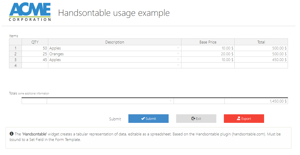
Handsontable
This widget requires some Content Script code to be injected in the CLEH scripts
Configuration
| Property | Type | Default | Usage |
|---|---|---|---|
| Basics | |||
| id | select | Form's field | |
| Table column | textareasplit | Mapping between set fields and table columns | |
| Reload entire table through ajax | checkbox | false | If true, anytime the the value of a cell is changed the entire table is updated through an AJAX call. This feature can be used to implement complex calculation among cells' values. |
| Totals | |||
| Show totals | checkbox | false | Display an additional row where to display aggregate functions (SUM, AVG, MIN, MAX) result for each columns. |
| Totals columns | textareasplit | List of columns source fields for which you want to display 'aggregate' information. Aggregate information can be computed using any operation out of: 'SUM', 'MIN', 'MAX', 'COUNT', 'AVG' | |
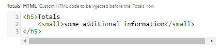
| Totals' HTML | textarea | Custom HTML code to be injected before the 'Totals' row | |
| Display context menu | checkbox | true | Enables a row-level context menu, that can be used for adding, removing or formatting row's cells |
| Row headers | checkbox | true | Display the row number |
| Auto wrap row | checkbox | true | If true, pressing TAB or right arrow in the last column will move to first column in next row. |
| Rows resize | input | true | Turns on Manual row resize, if set to a boolean or define initialrow resized heights, if set to an array of numbers. |
| Columns resize | input | true | Turns on Manual column resize, if set to a boolean or define initialrow resized heights, if set to an array of numbers. |
| Rows move | input | true | Turns on Manual row move, if set to a boolean or define initial row order, if set to an array of row indexes. |
| Appearance | |||
| columns | select | 6 | Number of grid columns used by the widget |
| Fixed size | checkbox | false | Preserves widget proportional dimension |
| Label Text | input | Table | The text label of this input field |
| Label Size | select | The size of the input label | |
| Label Position | select | The widget's label position one out: right, top, left, bottom | |
| Grid width | input | Grid's total with (e.g. 400px) | |
| Grid height | input | Grid's total height (e.g. 400px) | |
| showIf | comlpex | true | Widget's visibility rules |
| Additional css classes | input | Custom CSS classes to be added to the widget's container | |
| Additional configuration for columns | Content Script | Additional configuration for grid's columns. It can be used to customize columns' formatting, behaviour and nature. See https://docs.handsontable.com for detailed information regarding columns customization |
Example
Example Configuration
| Property | Value | ||
|---|---|---|---|
| Basics | |||
| Table column | 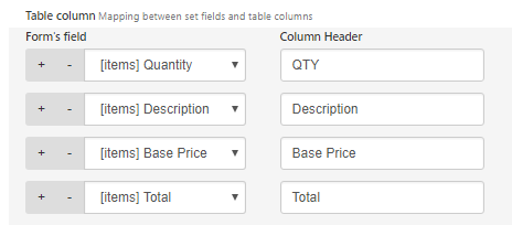 | ||
| Reload entire table through ajax | true | ||
| Totals | |||
| Show totals | true | ||
| Totals columns | 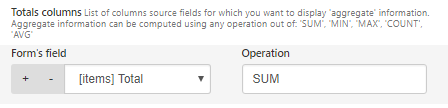 | ||
| Totals' HTML |
| ||
| Columns resize | [10%,50%,20%,20%] | ||
| Appearance | |||
| columns | 12 | ||
| Label Text | Items | ||
| Label Position | top | ||
| Grid height | 200 | ||
| Additional configuration for columns |
| ||