Working with Smart Pages
This guide introduces the basic functionalities related to the Module Suite Smart Pages.
Basic concepts
The Module Suite Smart Pages is an optional extension to Module Suite that introduces new features for those users that need an extra level of flexibility when creating customized SmartUI perspectives, and, more broadly, for those who prefer using the SmartUI in place of the Classic UI for their Content Server applications.
The extension includes the following components:
- A new set of SmartUI tiles, available within the Perspective Builder Widget Library
- A set of Content Script snippets that showcase how to create datasources for the SmartUI tiles
- A collection of Beautiful WebForms templates and related resources that enable embedding of Beautiful WebForms views within a SmartUI perspective
Module Suite Tiles in the Widget Library
The following tiles are available in AnswerModules Module Suite section:
- Content Script Result
- Content Script Tile Chart
- Content Script Tile Links
- Content Script Tile Tree
- Content Script Node Table
- Content Script Tile News
- Content Script Tile Tiles
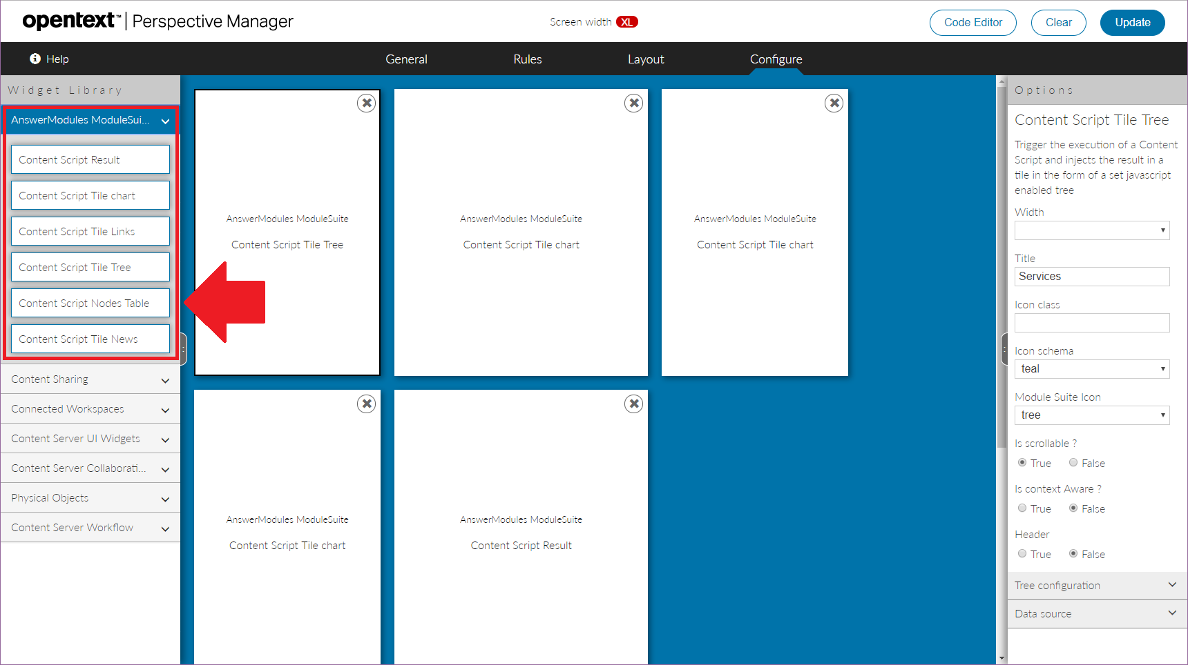
Tile Configuration
Module Suite tiles share some common configuration options, while other options are specific to single tiles.
Common options include the configuration of the external frame (header, scrolling content, title, icon) and the configuration of the tile's Data Source. All Module Suite tiles require to specify a Content Script object that will be executed when the tile content is created. This script acts as a Data Source for the tile, and allows to make its content dynamic.
Through the configuration, it is also possible to pass additional parameters to the script. The parameter will be available to the developer within the params variable.
When configuring the tile's icon, two different approaches are possible:
- specify a CSS style class to apply to the icon element. This should define the rules needed to apply the desired icon.
- specify the name (and color scheme) of the desired icon among the ones available in the Module Suite icon set. See the icon reference cheat sheet for a full list of options.
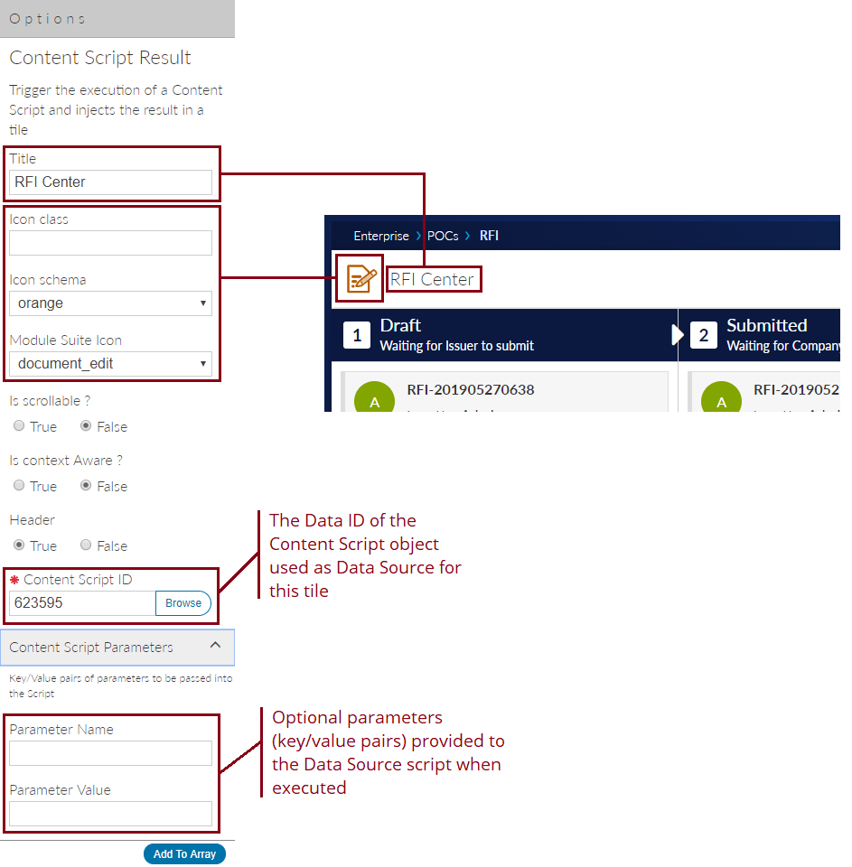
Tile: Content Script Result
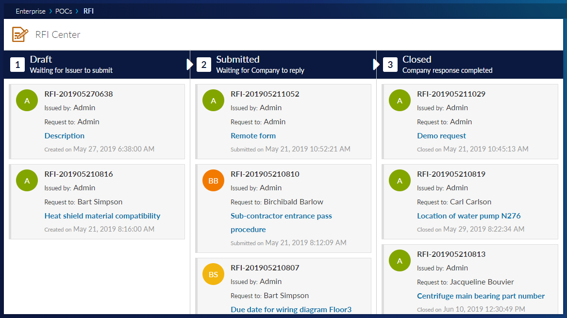
The Content Script Result is a general-purpose tile that can be used to inject any output generated by a Content Script Data source into a SmartUI perspective.
Tile: Content Script Tile Chart
The Content Script Tile Chart is a tile who's purpose is to create interactive charts within the SmartUI. The data shown in the charts will be provided by a Content Script data source.
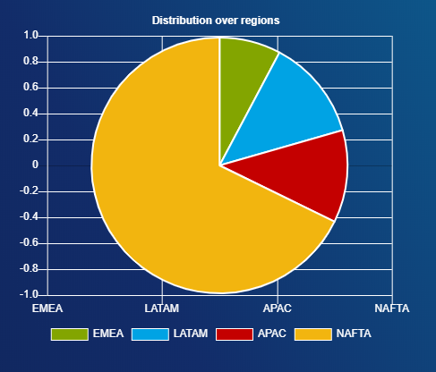
Chart tiles leverage two different javascript libraries:
- Chartist (supported for backward compatibility)
- Chart.js (suggested)
Depending on the selected chart type, the appropriate configuration has to be provided in JSON format. The following sample configuration produces the pie chart in the image above.
def chart = [
    widgetConfig:[
        reloadCommands:["updateChart"],
        tileLayoutClasses:"am-nobckg",
        tileContentClasses:"am-nobckg"
    ],

    data: [

        labels:["EMEA","LATAM","APAC","NAFTA"],

        datasets: [

            [
                data:[154,254,232,1345],
                backgroundColor: ["rgb(131,165,0)","rgb(0,163,228)","rgb(196,0,0)","rgb(242,181,15)","rgb(0,168,142)","rgb(161,95,167)","rgb(242,122,0)"],
                hoverBackgroundColor: ["rgb(86,108,0)","rgb(0,120,168)","rgb(136,0,0)","rgb(188,140,10)","rgb(0,108,91)","rgb(125,72,130)","rgb(182,92,0)"]
            ]
        ]
    ],

    options: [

        maintainAspectRatio: false,

        title: [
            display: true,
            text: 'Distribution over regions',
            position: 'top',
            fontColor:"#fff"
        ],

        legend: [
            display: true,
            position: 'bottom',
            labels:[
                fontColor:"#fff"
            ]
        ],
        scales: [
            xAxes: [[
                gridLines: [
                    display: true,
                    color: "#FFFFFF"
                ],
                ticks: [
                    fontColor: "white",
                ]
            ]],
            yAxes: [[
                gridLines: [
                    display: true,
                    color: "#FFFFFF"
                ],
                ticks: [
                    fontColor: "white"
                ],
            ]]
        ]

    ]
]

json(chart)
Tile: Content Script Tile Links
The Content Script Tile Links is a tile meant to create a customizable list of clickable links. The data controlling the links is provided by the backing Content Script data source.
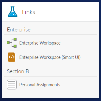
The following Content Script sample configuration produces the Links tile shown above.
def links = [
    links:[
        [
            issection:true,
            name:"Enterprise"
        ],
        [
            issection:false,
            name:"Enterprise Workspace",
            icon:"${img}csui/themes/carbonfiber/image/icons/assignment-workflow.svg",
            url:"${url}",
            newtab:true
        ],
        [
            issection:false,
            name:"Enterprise Workspace (Smart UI)",
            icon:"${img}csui/themes/carbonfiber/image/icons/mime_xml.svg",
            url:"${url}/app/nodes/2000",
            newtab:true
        ],
        [
            issection:true,
            name:"Section B"
        ],
        [
            issection:false,
            name:"Personal Assignments",
            icon:"${img}csui/themes/carbonfiber/image/icons/mime-form.svg",
            url:"${url}?func=Personal.Assignments",
            newtab:false
        ]
    ]
]

json(links)
Tile: Content Script Tile Tree
The Content Script Tile Tree creates an interactive tree structure with nodes that can be expanded and collapsed. The tree structure uses a Content Script data source for the initial data and for subsequent ajax data load calls.
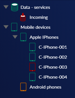
The following sample configuration generates the tree in the image above.
tree =  [
    widgetConfig:[tileLayoutClasses:"am-nobckg",
        tileContentClasses:"am-nobckg"],
    "plugins" : [ "wholerow"],
    core:[

        'data': [
            [
                action:'navigate',
                icon: "am_icon_teal am_icon_database",
                id: 1,
                text: "Data - services",
                children:[
                    [
                        action:'navigate',
                        icon: "am_icon_red am_icon_database_in",
                        id: 2,
                        text: "Incoming",
                    ]

                ]
            ],
            [
                action:'navigate',
                icon: "am_icon_teal am_icon_tablet",
                id: 3,
                text: "Mobile devices",
                children:[
                    [
                        action:'navigate',
                        icon: "am_icon_teal am_icon_tablet",
                        id: 8,
                        text: "Apple IPhones",
                        children:[
                            [
                                action:'navigate',
                                icon: "am_icon_teal am_icon_tablet",
                                id: 4,
                                text: "C-IPhone-001",
                            ],
                            [
                                action:'navigate',
                                icon: "am_icon_teal am_icon_tablet",
                                id: 5,
                                text: "C-IPhone-002",
                            ],
                            [
                                action:'navigate',
                                icon: "am_icon_red am_icon_tablet",
                                id: 6,
                                text: "C-IPhone-003",
                            ],
                            [
                                action:'navigate',
                                icon: "am_icon_teal am_icon_tablet",
                                id: 7,
                                text: "C-IPhone-004",
                            ]
                        ]
                    ],
                    [
                        action:'navigate',
                        icon: "am_icon_orange am_icon_tablet",
                        id: 9,
                        text: "Android phones"
                    ]


                ]
            ]
        ],
        'themes': [
            'name': 'proton',
            'responsive': true
        ]
    ]
]

json(tree)
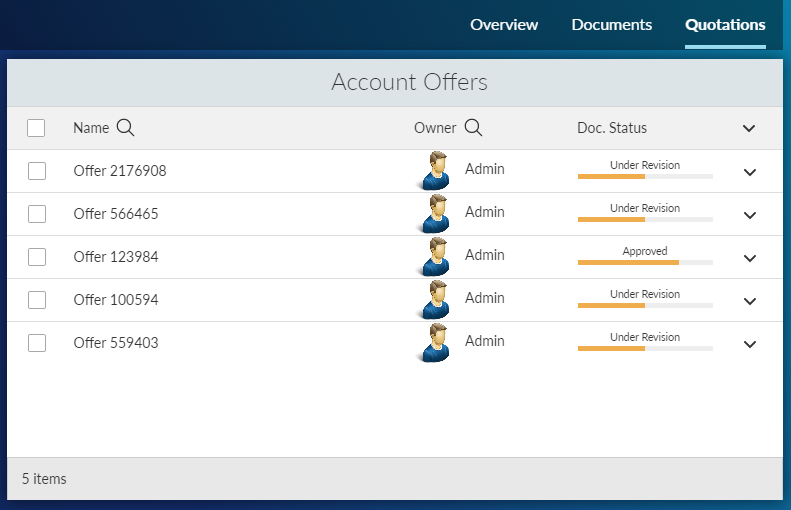
Tile: Content Script Node Table
The Content Script Node Table is an enhancement of the standard Node Table tile. The tile uses a Content Script as data source, allowing to set up any custom business logic to generate the list of nodes to be shown.
def targetSpaceFilter = 2000

def subtypeFilter = 144


def paging = [actual_count:0,
              limit:((params.limit?:"30") as int),
              page:((params.page?:"1") as int),
              page_total:0,
              range_max:0,
              range_min:0,
              total_count:0,
              total_row_count:0,
              total_source_count:0]

def pageSize = paging.limit
def offset = (paging.limit * (paging.page - 1))
def firstRow = offset + 1
def lastRow = firstRow + paging.limit

nodes = []

def nameFilter = null
if( params.where_name ){
  nameFilter = "%${params.where_name}%"
}

def ownerFilter = null
if( params.where_owner ){
  ownerFilter = "%${params.where_owner}%"
}

def sortingOrderParam  = 'desc'
def sortingColumnParam  = 'name'

def sortingOrder  = 'DESC'
def sortingColumn  = 'DTree.Name'


if( params.sort && params.sort.contains('_') ){

 def sorting = params.sort.split('_')

    sortingOrderParam  = sorting[0]
    sortingColumnParam  = sorting[1]

    sortingOrder = ( sortingOrderParam == 'asc' ) ? 'ASC' : 'DESC'


    switch( sortingColumnParam?.trim() ){

     case 'name' :
            sortingColumn = 'DTree.Name'
            break

        case 'owner' :
            sortingColumn = 'KUAF.ID'
            break

        default :
         sortingColumn = 'DTree.Name'
         break
    }

}


try{


    def queryParams = [targetSpaceFilter as String]
    def queryIndex = 1

    def permExpr = "(exists (select DataID from DTreeACL aclT where aclT.DataID=DTree.DataID and ${users.getRightsStringForSQL("RightID", false)} and See >1 ))"


    sqlCode = """ select DTree.DataID DID,
       DTree.Name NAME,
       overall_count = COUNT(*) OVER()

           from DTree
     LEFT JOIN KUAF ON DTree.UserID = KUAF.ID

           where DTree.ParentID = %1 """

    if(subtypeFilter){
        sqlCode += " and DTree.SubType LIKE %${++queryIndex} "
        queryParams << (subtypeFilter as String)
    }

    if(nameFilter){
        sqlCode += " and DTree.Name LIKE %${++queryIndex} "
        queryParams << (nameFilter as String)
    }

    if(ownerFilter){
        sqlCode += " and (KUAF.Name LIKE %${++queryIndex} OR KUAF.LastName LIKE %${queryIndex} ) "
        queryParams << (ownerFilter as String)
    }

    if(!users.current.canAdministerSystem){
     sqlCode += " and ${permExpr} "
    }

    sqlCode += """
                   ORDER BY ${sortingColumn} ${sortingOrder}
                    OFFSET ${offset} ROWS
                    FETCH NEXT ${pageSize} ROWS ONLY

    """


    def queryResults

    if(queryParams){
        queryResults =  sql.runSQL(sqlCode, true, true, 100, *queryParams).rows
    } else {
     queryResults =  sql.runSQL(sqlCode, true, true, 100 ).rows
    }

    def totalCount = (queryResults) ? queryResults[0].overall_count : 0

    nodes = queryResults?.collect{it.DID as Long}


    paging << [
           actual_count:totalCount,
              page_total:((totalCount%paging.limit)+1),
              range_min:paging.page*paging.limit-paging.limit+1,
              range_max:(paging.limit*(paging.page+1)-totalCount)>0?(paging.limit*(paging.page+1)-totalCount):paging.limit*(paging.page+1),
              total_count:totalCount,
              total_row_count:totalCount,
              total_source_count:totalCount]

}catch(e){
    log.error("Error loading nodes table data",e)
    printError(e)
}


def drawStatusBar = { node ->

    def statusList = ['Draft', 'Under Revision', 'Approved', 'Published']
    def numSteps = statusList.size()
    def currStep = new Random().nextInt(statusList.size())
    def currStepName = statusList[currStep]


    def stepStyle = "height:100%; width:calc(100% / ${numSteps}); float:left; background-color:#F0AD4E; box-sizing:border-box;"

    def stepsHtml = ""

    (currStep + 1).times{
        stepsHtml += """<span style="${stepStyle}"></span>"""
    }


    return """
    <div style="text-align:center; font-size:.75em">${currStepName}</div>
    <div style="margin:3px 0; padding:0; height:5px; background-color:#eee;">${stepsHtml}</div>"""
}


def slurper = new JsonSlurper()

def processNode = { node->

    /* Add your custom node post-processing here */

    def myNode = asCSNode(node?.data.properties.id as long)

    def owner = myNode.createdBy
    def ownerBox = "<span><img src='/otcs/cs.exe/pulse/photos/userphoto/${owner.ID}/2000' style='max-height: 3em; border-radius: 50%; margin-right: 5px; vertical-align: middle;' /> ${owner.displayName}</span>"
    node.data.properties.owner = ownerBox

    node.data.properties.comment = myNode.comment
     node.data.properties.statusBar = drawStatusBar( myNode )

    return node
}

results = []

if( nodes.size() > 1 ){

    temp = slurper.parseText( docman.getNodesRestV2JSon(nodes, null, '{"properties":{"fields":["parent_id"]}}', true, true, []) )

    nodes.each{ node ->

        def jsonNode = temp.find{ it.data.properties.id == node }
        results << processNode(jsonNode)
    }


} else if (nodes.size() == 1 ){

    it = slurper.parseText(docman.getNodesRestV2JSon(nodes, null, '{"properties":{"fields":["parent_id"]}}', true, true, []))

    processNode(it)

    results = [it]
}


def columns = [

    type: [
            key:"type",
            name:"Type",
            type:2,
            type_name:"Integer",
            sort:false
       ]

    ,name: [
            key:"name",
            name:"Name",
            type:-1,
            type_name:"String",
            sort:true,
            align:"left"
          ]

    ,owner: [
            key:"owner",
            name:"Owner",
            type:43200,
            type_name:"String",
            sort:true,
            align:"left"
          ]

    ,statusBar: [
            key:"statusBar",
            name:"Doc. Status",
            type:43200,
            type_name:"String",
            sort:false,
            align:"left"
          ]

    ,comment: [
            key:"comment",
            name:"Comment",
            type:-1,
            type_name:"String",
            sort:false,
            align:"left"
          ]
]

json([paging:paging,
      columnsWithSearch:[ "name" , "owner" ],
      results:results,
      columns:columns,
      tableColumns:columns,
       widgetConfig:[
           reloadCommands:[ "updateData" ]
       ]
     ])
Embedding Beautiful WebForms views in SmartUI
In order to embed a Beautiful WebForms form in a SmartUI tile, it is possible to use a Content Script Result Tile with the following minimal configuration:
def formID = 123456 // the dataID of the form to embed
def viewID = 234567 // the dataID of the SmartUI form view, within the Form Template

form = forms.getFormInfo(formID)
view = asCSNode(viewID)

json([ output : view.renderView(binding, form),
       widgetConfig :[
           reloadCommands:[], // any SmartUI commands that will trigger a reload of the form
           tileContentClasses:"am-nobckg",
           tileLayoutClasses:"am-nobckg"
       ]
     ])
Form View Template
In order for the form to load resources compatible with usage within the SmartUI, you should use the "SmartView Embeddable" form template, available within the SmartUI extension libraries.
For additional details, see the dedicated section in the Beautiful WebForms documentation.
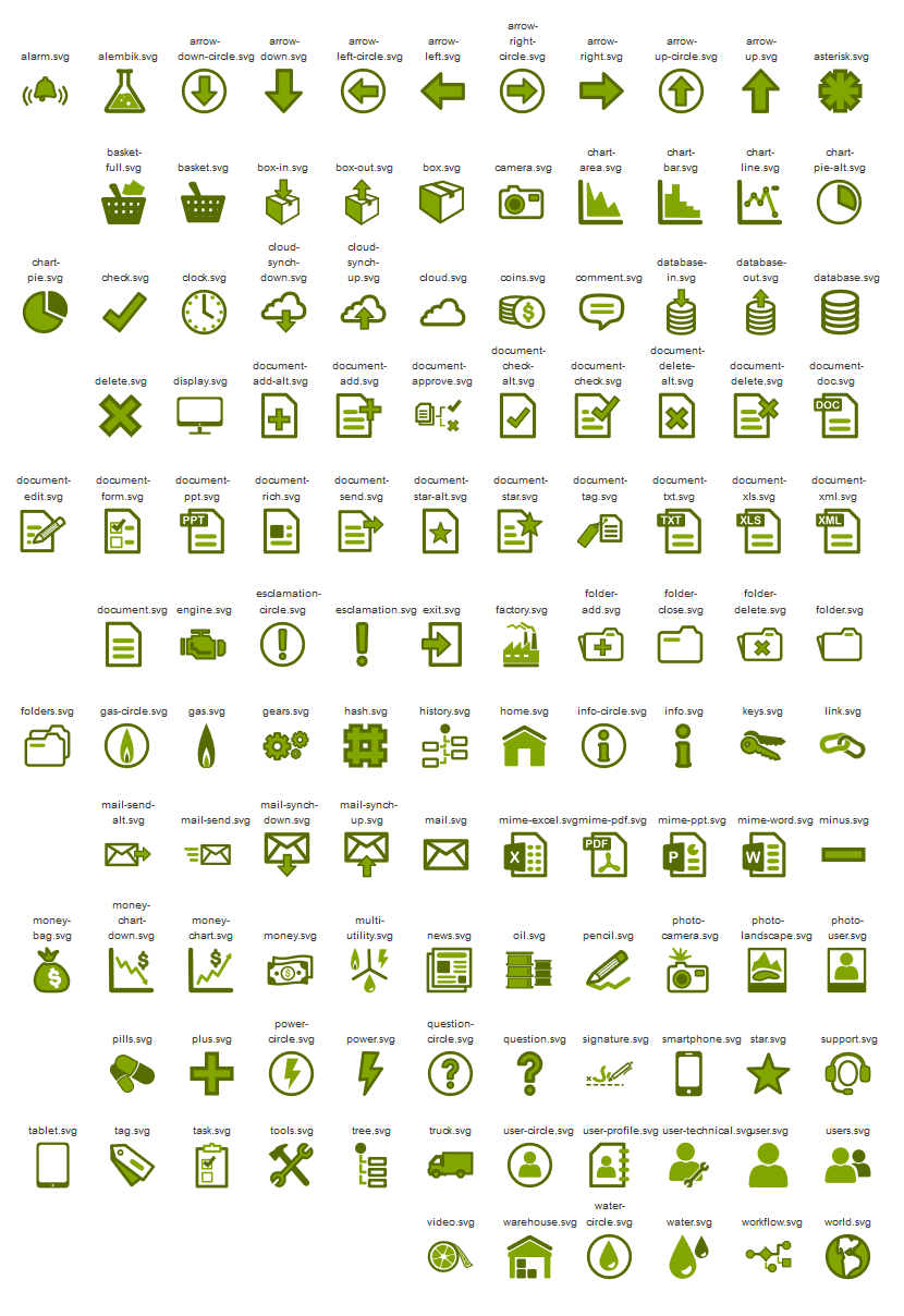
Icon reference cheat sheet
Iconset Color codes
Module Suite icons are available in the following colors:
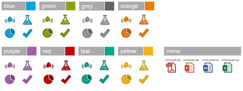
All icons
A complete list of the currently available icons is shown below: